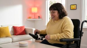
If you are helping a parent stay in their home longer, or you are planning ahead for your own later years, hiring interior house painters Colorado Springs can actually make the home safer, not just nicer to look at. A good paint job can improve visibility, reduce slips, make it easier to spot hazards, and even support other accessibility upgrades that help with aging in place.
That might sound a bit strong for something as simple as paint, but once you look at the details, it starts to make sense.
Why paint matters for aging in place
When people talk about aging in place, they usually focus on ramps, grab bars, walk-in showers, and maybe stair lifts. Those are all valid. Paint does not get the same attention, but it quietly touches almost every surface you see and use every day.
As we age, certain changes are common. They are not the same for everyone, of course, but many people notice:
- Lower contrast sensitivity
- More trouble with glare from bright light
- Reduced night vision
- Slightly slower reaction times
- Joint pain that affects balance and strength
None of this means a person cannot live at home. It just means the home needs to work a bit harder to support them. Paint color, finish, and placement can help with that. Or work against it.
A house can look fresh and still be hard to live in. For aging in place, paint should be planned for safety first and style second.
When you bring in a painter with some awareness of accessibility, you get a second pair of eyes on the home. Someone who can spot where contrast is poor, where glare might cause trouble, or where a darker color might hide a step edge. It is not a replacement for an occupational therapist, of course, but it can be a useful piece of the puzzle.
Common age related vision changes that paint can help with
I want to stay practical here, not medical, but a short overview helps explain why color choices matter so much.
Reduced contrast sensitivity
Many older adults can see objects, but have trouble seeing the edges where one surface ends and the next begins. If the hallway walls, trim, and doors are all almost the same shade, those edges can blur together.
Now picture someone walking at night to the bathroom. Their vision is already under strain, and the whole hallway feels like one flat surface. That is a fall waiting to happen, especially if there is even a small step or transition strip.
Good contrast is not about bold, trendy colors. It is about making edges and changes in level obvious at a quick glance.
Glare and shiny surfaces
Glare from glossy paint can be very uncomfortable for some people. It can cause squinting, headaches, and in some cases, brief moments where a person cannot quite see what is in front of them. Bright sunlight on a glossy wall or ceiling can create sharp reflections that look like moving shapes.
If you add in bifocals or trifocals, plus glossy floors, things can feel visually confusing. A thoughtful painter can reduce that with the right finishes.
Difficulty in low light
Older eyes usually need more light to see clearly. That is not news. But the way paint reflects light can either help a dim area feel clearer or make it feel like a cave.
Very dark colors in hallways, stairwells, or entry areas, especially combined with weak lighting, can hide obstacles and edges. On the other side, stark white everywhere can be harsh and tiring. The trick is a balanced middle, with enough light reflection but not too much glare.
How a residential painter can support safer aging in place
So what does a painter actually do differently when the goal is safety for older adults? Here are the main areas where a skilled residential painter can make a real difference in a Colorado Springs home.
1. Planning color contrast for navigation
This is one of the biggest safety wins. A painter can use color and contrast to guide movement through the home, almost like quiet visual cues.
- Doors vs walls: Painting doors a slightly darker or lighter color than the walls helps them stand out. This is helpful at night or for anyone with low vision.
- Trim and baseboards: Painting trim in a contrasting color makes edges visible, especially where the floor changes height or material.
- Steps and stairs: A different color on the tread edge or riser can highlight each step. It does not have to be loud, just enough contrast.
- Handrails: Using a color that contrasts with both the wall and the rail makes the rail easier to find quickly.
If you cannot see where a wall ends, a door starts, or a step begins, you are relying on memory instead of your eyes. That is a risk, especially when you are tired or in a hurry.
2. Choosing finishes that reduce glare
Many people still think higher gloss paint is always tougher or easier to clean. That used to be more true than it is now. Modern paints with lower sheen can still be very washable.
For aging in place, it often makes sense to use:
- Flat or matte on ceilings to cut glare from overhead lights
- Eggshell or low sheen on walls where there is heavy natural light
- Satin on doors and trim for durability without mirror like shine
In rooms like bathrooms and kitchens, painters might suggest products that handle moisture but still avoid strong reflections. It is a tradeoff that is worth talking through, room by room.
3. Making key features easy to see
Think about all the things in a home a person needs to find quickly, possibly in an urgent moment. Light switches. Thermostats. Grab bars. The edge of the shower. Outlets used for oxygen equipment or medical devices.
Careful paint choices around these areas can help. Some ideas you might discuss with a painter:
- A slightly darker or lighter paint behind light switch plates so they stand out
- Contrasting color behind grab bars, so the bar is not lost visually against the wall
- Differentiating the main bathroom door from other hallway doors with a unique but calm color
- Accent color behind thermostats or important control panels
This sounds small, maybe even fussy, until you picture someone waking up at 3 a.m., feeling unsteady, trying to find the light switch. Those seconds matter.
Room by room paint ideas for safer living
Every home is different, and people age in different ways. Still, there are some common patterns for each part of the house. It can help to walk through room by room, mentally, and ask how paint can support safety and independence.
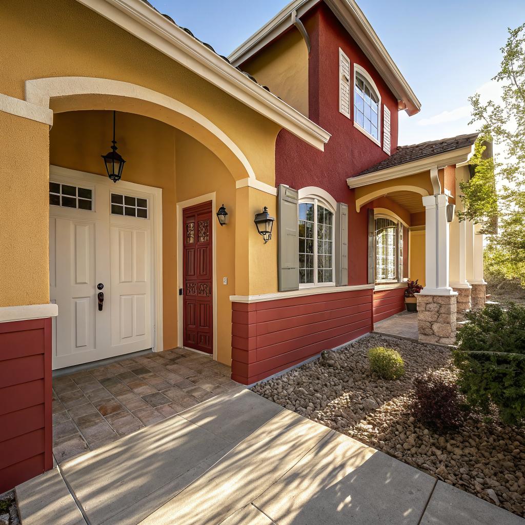
Entryway and front door
The entry is the transition between outside and inside. In Colorado Springs, with shifting light from snow, sun, and sudden weather changes, that transition can be harsh on the eyes.
Some practical paint ideas:
- Use a medium tone on the walls, not pure white, to reduce glare when coming in from bright sun or snow.
- Paint the door frame in a clear contrasting color from the wall so the opening is obvious.
- Mark any step at the threshold with a painted edge in a different color or sheen.
- Use a lighter color on the ceiling to reflect some light without shining directly into the eyes.
A painter can also look at how light hits the space during the day. Sometimes a color that looks calm at noon becomes very intense around sunset. Testing a few samples on the wall, instead of choosing from a tiny card, is helpful.
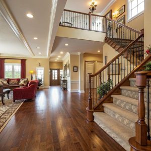
Hallways and circulation paths
Hallways are often narrow and dim. They are also where a lot of falls happen, especially near doorways and at the top of stairs.
Some safer paint choices here:
- Mid tone wall color that is light enough to reflect light but not so bright that it hurts the eyes.
- Trim and baseboards in a distinct shade so edges are clear.
- Doors that are slightly darker than walls, so you can see each doorway clearly.
- If there is a step down into a room, paint the step edge in a contrasting color.
If mobility devices are in use, such as walkers or wheelchairs, painters can suggest paints that resist scuffing on lower walls. That sounds cosmetic, but if walls are constantly marked, people sometimes avoid touching them for support, even when they really need that contact.
Living room and common areas
The living room is usually where family gathers, where someone might spend long hours if mobility is limited, and where caregivers or visitors spend time. Comfort and visual calm matter a lot.
Some considerations:
- Avoid extreme whites and very dark tones as the main wall color. They can either produce glare or absorb too much light.
- Choose a calm, medium light color so reading, sewing, or watching TV is easier on the eyes.
- Use a slightly different color on built in shelves or cabinets so edges are visible, reducing the chance of bumping into corners.
- If there are step downs into a sunken living area, mark those transitions clearly with paint.
I once saw a home where the sunken living room was only two steps below the hallway, and everything, including stairs and walls, was light beige. The owner had fallen more than once. After repainting the step edges and trimming the area in a deeper tone, those falls stopped. That is not a miracle story, just common sense, but it shows how small paint changes can matter.
Kitchen
The kitchen is full of hot surfaces, sharp tools, and spills. For someone aging in place, small visual mistakes can have bigger consequences here.
Things to look at with your painter:
- Good contrast between countertops and walls. If both are similar tones, it is harder to judge depth and see the edge.
- Cabinet doors and drawers that stand out from the wall so handles are easy to find.
- Backsplash colors that allow items like knives and utensils to stand out in plain view, reducing search time.
- Wall colors that avoid heavy glare from under cabinet or overhead lighting.
A painter may also help by suggesting a paint that stands up to frequent cleaning without needing high gloss. That can keep glare down while keeping the kitchen sanitary.
Bathroom
Bathrooms are high risk areas. Water, smooth surfaces, and quick movements do not mix well. Here, paint choices should work together with grab bars, non slip flooring, and proper lighting.
Some ideas to discuss:
- Strong contrast between walls and fixtures like the toilet, sink, and tub, so each stands out.
- Different colors for the floor and the tub or shower pan, so the edges are obvious.
- Slightly darker color behind grab bars, so the metal is easy to see, or the reverse if grab bars are dark.
- Non glossy paint on the ceiling and upper walls to avoid glare from bright bathroom lights.
If there is a curbless or low threshold shower, paint can be used to emphasize where the shower area begins. This can reduce surprises when stepping in or out with wet feet.
Bedroom
The bedroom often gets less attention in safety planning. That is a mistake, because many falls happen getting in and out of bed, using the restroom at night, or dealing with medication and medical equipment.
Some helpful paint approaches:
- Soft, medium light wall colors to avoid eye strain when waking up at night.
- Contrasting color for the door to the hallway and bathroom, so they are easy to spot in low light.
- A different shade behind the headboard or bed wall, which can also help caregivers orient themselves when they enter in the dark.
- Clear distinction between wall, trim, and floor color so room edges are easy to read visually.
Some families also paint a subtle accent near a bedside call button, phone, or medical alert device, so guests and backup caregivers can find it quickly. That is the type of small detail that does not show up in glossy home magazines, but it matters to people actually living with health needs.
Stairs
Stairs deserve their own section. They are a major concern for aging in place. Not everyone can or wants to move to a single level home, so making stairs as safe as possible is key.
Paint can support stair safety in several ways:
- Painting the nosing or front edge of each step in a contrasting color.
- Using a non glossy finish that still cleans easily, so the steps are not slippery.
- Painting handrails in a color that stands out from the wall.
- Using a lighter wall color to brighten the stairwell without harsh glare.
Many people resist the idea of visible step edges because they remember old style safety tape. A good painter can create a much more subtle effect, using tone and sheen instead of stripes.
Types of paint and finishes for aging in place
Color gets most of the attention, but paint type and finish also have a role in safety and long term health, especially for people who spend a lot of time indoors.
Low VOC and indoor air quality
Volatile organic compounds (VOCs) are chemicals that evaporate from some paints. They can cause strong smells and may irritate sensitive lungs, eyes, or skin. Older adults with asthma, COPD, or other breathing issues can be especially affected.
Many modern paints come in low or zero VOC formulas. These are often a better choice when painting a home where an older person will continue living during the work.
| Paint type | Pros for aging in place | Possible concerns |
|---|---|---|
| Low VOC latex | Lower odor, dries fast, easier on lungs, widely available | Quality varies, color depth can differ by brand |
| Zero VOC latex | Very low odor, better for sensitive breathing, good for bedrooms | Some need extra coats for full coverage |
| High gloss enamel | Durable, easy to wipe clean | High glare, more visual discomfort, can be slippery on floors or stairs |
| Eggshell / satin | Balance of cleanability and comfort, less glare than gloss | Still some sheen, can show wall flaws if lighting is harsh |
A painter familiar with Colorado Springs homes can recommend brands and products that hold up well in the local climate while keeping VOCs low. The dry air and altitude can affect how fast paint dries and how it looks on the wall, so experience does matter here.
Durability vs comfort
There is sometimes a tension between durability and visual comfort. High gloss paints tend to resist scrubbing, but they reflect more light. Very flat paints look soft and calm, but some scuff easily.
In an aging in place context, the balance might lean more toward comfort, especially at eye level, and durability at hand level. For example:
- Flat or matte on ceilings to reduce glare.
- Eggshell on upper walls.
- Satin on lower walls, doors, and trim where hands and mobility aids touch more often.
This mixed approach can be customized for each room. A good residential painter will usually walk you through these choices and may even suggest doing test patches so you can see the effect before committing.
Working with a painter when you are a caregiver
If you are a caregiver, you already have a lot on your plate. The idea of managing a painting project might feel like one task too many. That is fair. But with some planning, it can be made manageable and even helpful to your routine.
Timing and staging the work
It rarely makes sense to repaint the whole house at once when someone is living there, especially if they are frail or easily confused by change.
Some practical steps:
- Start with the highest risk areas, usually bathroom, stairs, and main paths between bed, bathroom, and kitchen.
- Plan work in blocks, maybe one or two rooms at a time, to avoid too much disruption.
- Talk with the painter about quiet hours if the person you care for needs rest during the day.
- Keep familiar items in sight, such as photos and personal objects, so spaces still feel recognizable after painting.
If dementia is part of the picture, changing colors too drastically can be unsettling. In those cases, a painter can sometimes adjust contrast and safety while keeping the overall feel of the room similar.
Questions to ask a residential painter
You do not have to become a paint expert. It helps more to know what to ask. Some questions might include:
- Do you have experience painting homes where an older adult or person with disabilities lives full time?
- What low or zero VOC products do you use, and how strong is the smell during and after painting?
- Can you help us improve contrast around stairs, doors, and grab bars?
- How do you handle moving furniture and protecting mobility aids or medical equipment?
- Can you work in stages so the person living here always has a safe bedroom and bathroom available?
You might get some confused looks if the painter is used to jobs that are only about color trends. That is not always a bad sign, but it is a sign that you will need to be more specific and perhaps share what you know about aging in place.
Balancing aesthetics and safety
One concern that comes up often is the fear that a home will start to look like a hospital. People worry that safety features, including high contrast paint, will make the home feel clinical or sad.
I think that worry is understandable but sometimes exaggerated. It is possible to:
- Keep a calm, warm color palette.
- Use contrast through tone rather than bright, clashing colors.
- Integrate safety features into the design calmly, not as loud warnings.
For example, instead of painting stair edges in bright yellow, a painter might use a slightly darker version of the existing stair color, just enough to catch the eye. Instead of painting grab bar walls in bold red, they might create contrast by making the wall a soft, muted tone while keeping fixtures light.
There is some personal preference involved here too. Some people enjoy strong colors and find them energizing. Others feel calmer in more neutral spaces. A good painter listens and adjusts, rather than forcing a standard look.
Coordinating with other accessibility work
Painting for aging in place is most effective when combined with other changes. A few examples:
- If a contractor is installing a ramp, the painter can mark edges and rails for visibility.
- If grab bars are being added, the painter can pre paint or touch up around mounting points.
- If lighting is being upgraded, the painter can adjust colors to match the new light level and tone.
- If flooring is changed, paint can help clarify transitions from one surface to another.
Some families work with an occupational therapist who provides a home safety assessment. That report can be shared with the painter, so the color and finish plan supports the recommended changes.
One thing to watch out for is the order of work. Painting too early, before grab bars or other fixtures are installed, might mean extra patching later. On the other hand, painting after heavy remodeling might slow down the project timeline. There is no perfect sequence in every case, but some coordination saves trouble.
Colorado Springs specific factors
Colorado Springs has some quirks that affect painting and aging in place. The strong sun, dry air, and rapid weather changes all play a role.
Sun exposure and fading
South and west facing rooms get a lot of intense sun. Colors can fade faster, and glare can be stronger at certain times of day.
A local painter who works in Colorado Springs homes regularly is more likely to know how certain colors behave in this light. They may steer you away from some very saturated tones in sun heavy rooms, or suggest subtle tints that stay comfortable year round.
Temperature swings and paint wear
Exterior paint has to handle cold winters and warm summers. While this article focuses more on interior safety, exterior entryways and porches matter too.
Good contrast on porch steps, railings, and door frames can help reduce falls when there is ice or snow. Exterior paints also need to resist peeling and chipping so edges stay clear over time. A chipped step edge, for example, can hide the line between horizontal and vertical surfaces.
When is repainting worth the disruption?
Painting takes time, costs money, and brings noise and activity into the home. So when is it worth doing, from a caregiving or health standpoint?
Some signs repainting could be more than cosmetic:
- Frequent near misses or stumbles on stairs or thresholds.
- Confusion about which door leads to the bathroom, especially at night.
- Complaints about harsh light, glare, or headaches in certain rooms.
- Difficulty locating switches, handles, or important equipment quickly.
- Peeling or flaking paint that might be a health concern, especially in older homes that may have lead based layers.
Repainting a whole house at once may not be realistic, but tackling key areas step by step can bring real safety gains without overwhelming the person living there.
Simple starting plan you can adapt
If this feels like a lot, here is a simple way to start thinking it through. You can adapt this to your situation.
- Walk through the home along the path from bed to bathroom to kitchen, both in daylight and at night with the usual lights on.
- Note any place where edges are hard to see, or where glare makes you squint.
- Mark the five most used doors and ask yourself if they stand out clearly from the walls.
- Look at stairs, inside and outside, and see how easy it is to see each step edge.
- List any rooms where someone in the home has complained about eye strain, headaches, or trouble finding things.
Bring that list to a painter and ask them to focus on those specific spots first. That focused approach usually gives better results than trying to rework everything randomly.
Common questions about painting for aging in place
Q: Is this just about picking brighter colors?
No. Brighter is not always better. The key is contrast and comfort, not just more vivid paint. In some cases, softer mid tone colors with clear contrast lines work better than very bright walls that cause glare.
Q: Can I do this myself or do I really need a professional painter?
You can certainly handle some changes yourself, especially small areas like marking step edges or painting around switches. A professional painter adds value with experience in finishes, product choices, and how colors behave in different light. For large projects, or if health and breathing are a concern, hiring a pro can reduce strain on both the older adult and the caregiver.
Q: Will safety focused paint choices hurt future home resale?
Q: How often should I repaint for aging in place needs?
There is no single schedule. Instead of thinking in years, watch for changes in health and mobility. If vision worsens, if mobility devices are added, or if new medical equipment changes how rooms are used, that is a good time to revisit paint and contrast.
Q: Where would you start if you could only paint one or two areas?
Personally, I would start with the path from the bed to the bathroom, including any hallways or stairs in between. That is where many night time falls and confusion episodes occur. After that, I would look at the main entry and any stairs. If those areas feel safer and easier to see, daily life usually becomes less stressful for both the person aging in place and anyone caring for them.