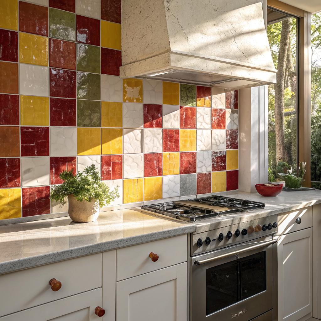
If you are wondering whether a zellige tile backsplash can work in a safer, more accessible home, the short answer is yes, it can, if you plan it with safety, cleaning, and visibility in mind. Zellige looks handmade and a bit irregular, but with the right layout, finish, and color, it can support aging in place, caregiving, and day‑to‑day accessibility instead of making things harder.
I think the trick is to treat zellige not just as a pretty design choice, but as part of the way the space functions for someone who might use a walker, has low vision, or has less grip strength. Once you see it that way, you start to notice details that many kitchen and bathroom photos never show: grout color, edge transitions, glare from under‑cabinet lights, and how easy it is to wipe food or soap splashes.
What makes zellige different, and why caregivers should care
Zellige tiles are hand‑made clay tiles, often with small size variations, tiny chips, and a non‑flat surface. That charm is what many people love. In a home where safety and accessibility matter, that same charm can be both a benefit and a challenge.
| Feature | How it helps | What to watch for |
|---|---|---|
| Small tile size | More grout lines can create visual reference points for people with low vision. | Busy patterns may be confusing for some neurodivergent users. |
| Handmade surface | Soft irregularity can reduce the harsh, clinical feel of accessible design. | High gloss can create glare under strong lighting. |
| Rich color range | You can build strong contrast between countertop, backsplash, and cabinets. | Too little contrast makes edges hard to see and increases fall and spill risk. |
| High‑fire glaze | Resists stains, splashes, common cleaners. | Some darker colors can show soap or mineral spots more clearly. |
If you are caring for someone at home, you probably notice how much time you spend in the kitchen and bathroom. A backsplash might feel like a small detail, but it affects:
- How easy it is to see where the counter ends
- How long it takes to wipe up spills and splashes
- How clinical or warm the space feels
- Whether the person you care for feels independent in that room
A safer accessible home is not just grab bars and ramps. It is also colors, textures, and surfaces that make daily tasks easier, not harder.
Design principles: safer zellige backsplashes without losing the charm
Before looking at specific rooms, it helps to set a few ground rules. They are not strict rules, but they can guide choices.
1. Use contrast to support low vision and aging eyes
Many falls and spills happen because edges blend together. A light countertop against a nearly identical light backsplash can be beautiful in a photo, but tricky in real life if someone has cataracts, macular degeneration, or just aging eyes.
With zellige, you can create clear visual borders between surfaces.
- Pair a cream or beige zellige tile with a darker countertop.
- Use darker grout with light tiles so the grid of tiles is visible.
- Or do the reverse: deeper tile color with a light, calm grout.
Think about how the room looks from a wheelchair height or from across the room, not just standing at the counter with perfect vision.
Test this by taking a quick photo of your sample board and turning the image to black and white on your phone. If the counter and backsplash blend into a single gray mass, the contrast is probably too low.
2. Control glare and reflection
Zellige tiles often have a glossy finish. That shine can look beautiful in soft daylight, but under bright LED under‑cabinet lights it can turn into sharp reflections that are uncomfortable for people with migraines, sensory sensitivities, or low vision.
You do not have to avoid glossy zellige. You can handle glare with:
- Dimmer switches for under‑cabinet and vanity lighting
- Warmer bulbs instead of cool blue‑white bulbs
- Tile layout that avoids full rows of tiles at eye level where lights hit directly
If someone in your home is sensitive to light, consider asking your tile supplier about slightly satin or semi‑matte zellige, or combining glossy tiles with more matte finishes elsewhere so the overall effect is softer.
3. Choose grout that supports hygiene and visibility
Caregivers know the truth: grout is where cleaning time goes. Small tiles mean more grout lines. That is not always bad, but you should be honest about your cleaning habits and the type of care you give.
Some practical notes:
- Use a high‑quality grout sealer and reapply on a schedule you can stick to.
- Avoid pure white grout in heavy cooking zones if you do not have time for regular scrubbing.
- Pick a grout color that shows dirt just enough. If it hides dirt completely, you might miss areas that need cleaning, which matters if someone has a weak immune system.
Grout that is too light can stain, but grout that hides everything can let mold and bacteria grow without you seeing it.
For accessible homes, I think a mid‑tone grout is a good middle path. It hides small stains but still shows where wiping is needed.
4. Plan smooth edges and transitions
While backsplash tile does not directly affect walking surfaces, exposed sharp edges can still catch sleeves, tubing, or soft skin. Some people brush walls for balance as they move through a space, especially near counters.
Ask your installer to:
- Use trim tiles or bullnose pieces at outer edges.
- Avoid sharp exposed corners at doorways or along the sides of full‑height backsplashes.
- Fill any gaps between counter and tile so crumbs and liquids do not collect where they are hard to clean.
This planning sounds minor until you are trying to tidy up a space where someone with limited mobility eats, cooks, or takes medication and you keep finding sticky spots where the backsplash meets the counter.
Accessible kitchen ideas with zellige tile backsplashes
Kitchens are busy and often crowded. For caregivers, an accessible kitchen can mean fewer accidents and less strain. Zellige can fit into this, but it has to serve the person cooking, not just the person taking photos.
Color choices that support safe cooking
Color is not just style. It helps your brain process depth and distance. When counters, walls, and cabinets all share the same value, spills are harder to see. With boiling water or grease, that can be risky.
Some practical color pairings:
- Light tile with dark counter: Cream zellige above a charcoal or deep brown counter creates a clear edge.
- Mid‑tone tile with light counter: Warm gray or soft beige zellige against a white or pale stone top works well for people who prefer light spaces but still need contrast.
- Dark accent near the cooktop: A strip of deeper tile color or darker grout behind the stove can make pots, pans, and knobs easier to see.
Try to avoid a backsplash that exactly matches the countertop color, unless you add contrast in cabinets or hardware.
Layout choices that reduce visual clutter
Zellige already has variation in each tile. Once you add a complicated pattern, it can turn into visual noise. This does not bother everyone, but people with dementia, autism, or brain injuries can find busy patterns exhausting or confusing.
Some calmer layouts:
- Simple stacked pattern instead of herringbone or chevron
- One main tile color, maybe with a very small border near the top
- Large sections of single color near key work areas like the sink and stove
I once visited a kitchen where the zellige pattern behind the stove shifted direction three times. It looked clever, but the owner admitted that her mother with dementia got distracted watching the pattern and lost track of what she was cooking. That might sound extreme, but it shows how small design choices can affect daily safety.
Under‑cabinet lighting and zellige: finding a balance
Good light is one of the easiest ways to support aging eyes. It makes cutting, reading labels, and cleaning safer. At the same time, strong task lighting shining right on glossy tiles can cause reflections or sharp bright spots.
Try this combination:
- Install continuous LED strips instead of single bright pucks to reduce hotspots.
- Use a warm color temperature, around 2700K to 3000K.
- Add a dimmer so you can set a softer level at night.
Then, once the tiles are installed, stand or sit at the height of the main cook and the main care recipient. Look straight at the backsplash with lights on. If you see strong glare, adjust the angle or brightness if you can.
Zellige behind the stove: heat, cleaning, and safety
The area behind the stove is where grease, steam, and tomato sauce all meet. For caregivers, it is often the spot that needs the most frequent cleaning. Here, zellige can be very practical if you set things up correctly.
Consider:
- Extending the backsplash at least to the bottom of the range hood, not stopping halfway.
- Choosing a glaze that tolerates gentle scrubbing with non‑abrasive cleaners.
- Using a grout color that will not show every tiny grease spot but still lets you see what you are wiping.
If the person you care for sometimes cooks independently, think about how much effort they can reasonably put into cleaning. Highly textured surfaces near the stove can trap oil. Zellige usually has soft irregularity, not deep texture, which helps. Just make sure the installer does not leave high ridges of grout.
Bathroom zellige backsplashes for safer daily care
Bathrooms are where slips and infections are most common, and caregivers often spend a lot of time there helping with bathing, tooth brushing, and medication.
A backsplash around the vanity or behind a pedestal sink can sound like a small decision, but it affects both hygiene and comfort.
Choosing colors for calm, clarity, and dignity
Many people prefer bathrooms that feel calm and non‑clinical. At the same time, you need enough contrast so that edges and fixtures are clear for someone who is unsteady or confused.
Some ideas:
- Cream or warm gray zellige behind a white sink gives a soft but noticeable boundary.
- Soft beige or light brown tiles can warm up grab bars and accessible fixtures that might otherwise look very medical.
- A slightly darker band of tiles at the level of the faucet handles helps people find controls more easily.
I have seen a few bathrooms where everything was pure white: walls, tile, grout, fixtures. They looked clean on Instagram, but a relative with low vision described it as “like being inside a glowing box” where it was hard to judge distance. Zellige in a gentle color can break that effect.
Backsplashes around accessible vanities
For wheelchair users or people who sit to brush their teeth, water tends to splash further across the wall. A higher backsplash can protect drywall and prevent mold, which matters if someone has respiratory issues.
| Vanity type | Suggested backsplash height | Accessibility note |
|---|---|---|
| Standard standing vanity | 4 to 8 inches above the counter | Fine for most users, easier to install grab bars nearby. |
| Wheelchair accessible, open below | 12 to 18 inches, wrapping the sides if possible | Protects walls from seated splash zones and cleaning. |
| Pedestal or wall sink in care setting | Full height from sink rim to 4 feet or more | Better hygiene in spaces with frequent handwashing or assistance. |
A taller zellige backsplash can also give caregivers peace of mind when washing hair in a sink or helping someone rinse off, since you worry less about water soaking into paint and causing hidden damage.
Mirror, lighting, and backsplash working together
For bathroom accessibility, the interaction between mirror, lights, and tile matters more than any one piece.
- Keep the tile layout simple directly behind the mirror so reflections are not confusing.
- Use side lighting at face level when possible so light is even and does not bounce sharply off the tile.
- If someone uses the mirror for lip reading, shaving, or applying medication, avoid patterns that appear behind their reflection at eye level.
It can sound like you are overthinking this until you stand in front of a strongly patterned backsplash with lights on both sides. Some people do not notice. Others find it tiring after a few minutes, especially in the morning or late at night when they are already low on energy.
Zellige in showers and wet zones: where to be extra careful
Many people like the idea of a zellige tile shower because it feels like an old spa. For accessible homes though, you should pause and be honest about the risk level and the type of care involved.
Zellige is usually glazed and water‑resistant, but the grout, layout, and maintenance around it matter a lot when the space is fully wet every day.
Is zellige tile right for a fully accessible shower?
This is one area where I would not just say yes to every idea. A few points to think about:
- More grout lines mean more places for mold, especially in corners and niches.
- Irregular surfaces can hold tiny droplets that need more wiping to dry.
- Glossy tiles on walls are fine, but for floors you need non‑slip surfaces, sometimes with a textured finish that is different from standard zellige.
If the person using the shower has very fragile skin, is prone to infection, or if caregivers already feel stretched, a simpler large‑format wall tile might be easier to maintain for the main shower area, with zellige used as an accent where it stays mostly dry.
Not every beautiful material is right for every accessible space. Sometimes keeping a shower easy to clean is more compassionate than making it look like a spa.
Safe ways to use zellige in or near showers
If you still want that handmade look in a bathroom that includes an accessible shower, you can balance things.
- Use zellige on the dry wall outside the shower doorway or at the vanity area.
- Add a zellige border or band at eye level in the shower, but keep lower splash zones in a tile that is simpler to clean.
- Keep shower niches large and smooth, not tiny and split into many small compartments.
This way you still get the warmth and character without creating extra headache in the high‑maintenance areas.
Color ideas for different care needs and moods
People often pick tile colors just based on trends. In a home where caregiving, accessibility, and health all mix together, color can also support mood, routine, and independence. Here are a few directions that often work well.
Cream and beige zellige: warm and low stress
Cream and beige tiles sit in a comfortable middle zone. They are light enough to feel clean, but not harsh. For people with dementia or anxiety, softer contrast and warm tones often feel safer and more familiar than stark black and white.
- Kitchen: Cream tiles with a medium wood or dark stone counter give a homey feel while still marking edges.
- Bathroom: Beige tiles behind grab bars can make the bars look less like hospital equipment.
- Laundry or care prep areas: Warm light tiles keep spaces bright for folding, sorting medicine, or doing wound care.
One caution: if the person you care for has very low vision, cream tiles next to light beige counters may not give enough contrast. In that case, darken either the tile or the counter.
Soft grays and browns: grounding and easier to keep looking clean
Warm gray and brown tones can hide some of the small marks of daily use without looking dull.
- Warm gray zellige over a white or light stone counter works well for people who like a modern look but still want softness.
- Brown tiles near dining nooks or snack prep areas are forgiving of the occasional coffee or tea drizzle.
For accessible design, pairing warm gray tile with darker hardware and clear, matte grab bars can keep everything legible without feeling cold.
Soft accent colors: gentle interest without overload
Bright color has its place, but in a home that already holds medical equipment, daily care, and possibly stress, very strong tile colors can feel like too much. Still, a small area of color can help with orientation.
Some uses that often work:
- A narrow band of soft pink or muted blue zellige at eye level in a bathroom to act as a visual landmark.
- A colored tile panel behind a specific appliance so it is easy to describe: “Meet me by the green tile near the microwave.”
- A small splash of color in a child or teen’s bathroom, while keeping the main field tiles calmer for daily use.
If you are supporting someone with dementia, keeping the main tile color consistent through connected areas can reduce confusion. Use color shifts to mark real changes like different rooms or levels, not every small zone.
Planning, installation, and maintenance with caregivers in mind
Even the best tile choice can turn into a problem if installation or maintenance ignore accessibility. Here are a few less glamorous details that matter.
Talk to the installer about accessibility, not just style
Many tile installers focus on layout that looks balanced from a design point of view. For a caregiving home, you need them to think about how people move and clean.
When you meet, mention:
- Who will be using the space, including age, height, and mobility.
- Where wheelchairs or walkers might touch walls.
- Which walls or zones need to be the easiest to clean.
- Whether you are planning for future grab bars or medical equipment.
If they seem uninterested in these points, that is a small red flag. Your home is not a showroom. It is a care space.
Cleaning routines that do not exhaust caregivers
Caregivers already have a lot on their lists. A backsplash that needs constant special treatment will either be neglected or cause frustration.
Try to build a simple rhythm:
- Daily: quick wipe of major splash zones during other tasks, like after dishwashing or brushing teeth.
- Weekly: use a gentle cleaner on grout lines that are exposed to food, soap, or toothpaste.
- Every few months: check for cracked grout, mold spots, or loose tiles and deal with them early.
Check cleaner labels to be sure they work with glaze and grout, but do not fall for harsh products that claim to work miracles. A softer, more regular routine is usually better for both the tile and the people who spend time in the room.
Designing for future changes
Care needs change. Someone who walks today might want a walker next year. A child might grow into a teen with different needs and preferences. When you pick a backsplash, think about how flexible it will be.
- Neutral but warm colors tend to adapt better to changing furniture and fixtures.
- Leaving some blank wall space near backsplashes allows for future grab bars or shelves without cutting through tile.
- Using common tile sizes can make repairs easier if a few pieces ever need to be replaced.
The goal is not to predict everything. It is to avoid painting yourself into a corner where a beautiful but very specific backsplash makes later adaptations harder or more expensive.
Questions and short answers on zellige backsplashes in accessible homes
Can glossy zellige tiles work for someone with low vision?
They can, but only if you manage contrast and glare. Choose tile and grout colors that clearly separate the backsplash from the counter and cabinets. Use dimmable and warm lighting to cut down on sharp reflections. If glare remains an issue, look for slightly less shiny tiles or balance them with matte finishes nearby.
Is zellige too hard to keep clean for a busy caregiver?
Not necessarily. The glaze itself is usually easy to wipe. The concern is the number of grout lines and how stained they might get. Choose a mid‑tone grout, seal it well, and plan quick, regular cleaning instead of rare, intense scrubbing. Avoid using zellige in the messiest, hardest to reach shower corners if you are already stretched thin.
Should I use zellige inside an accessible shower?
Sometimes, but not always. For a low‑maintenance, high‑use accessible shower, simpler, larger tiles with minimal grout are often easier for long‑term care. You can still use zellige on nearby dry walls or as small accents in the shower. If you do cover full shower walls with zellige, be ready for more detailed cleaning, and use a very good grout and waterproofing system.
What color zellige works best for aging in place?
There is no single best color, but gentle neutrals with clear contrast work well. Cream, warm gray, and soft beige tiles often feel calm and familiar, especially when paired with darker counters or cabinets. The key is to make sure edges and controls stand out visually so tasks like cooking, brushing teeth, or washing up feel safe and manageable for as long as possible.